# 配置
# 默认配置
import './index.less';

import A from './imgs/A.png';
import B from './imgs/B.png';
import C from './imgs/C.jpeg';
import D from './imgs/D.jpeg';

const logos = [A, B, C, D];
const names = ['A', 'B', 'C', 'D'];

export default {
  // 组件类型,这个组件的唯一标识
  type: 'Test0430',

  // 行为名称,显示在行为选择框中的内容
  name: 'test0430',

  // 组件分类:
  // 分为两种分类: action(行为) 和 widget(ui组件)
  // 初始化时确定,请务必不要修改
  category: 'widget',
  // 是否使用rem,如果想要使用rem,将rem设为true (已废弃)
  useRem: false,
  // 可视化配置参数,当选择了当前行为后,出现在行为选择框之下
  // 配置类型分为:
  //     Set(key-value集合)
  //     CheckBox(多选)
  //     ColorPicker(颜色选择)
  //     FilePicker(文件选择)
  //     NormalText(普通文本)
  //     RichText(富文本)
  //     Select(下拉选择)
  //     Slider(滑块-可拖动调整数值)
  //     Radio(单选)
  //     RadioButton(单选-按钮形式)
  //     WidgetSelector
  config: {
    // 自定义配置 1
    content: {
      // @required 配置前置文字,required
      text: '按钮文字',

      // @optional 配置字段的提示,在text 上hover 时出现
      msg: '提示内容',

      // @required 配置类型,RichText代表富文本
      type: 'NormalText',

      // @optional 默认值
      value: '请选择'
    },

    // 自定义配置 2
    backgroundColor: {
      text: '按钮颜色',

      msg: '提示内容',

      type: 'Select',

      value: 'white',

      // 选项
      options: [
        {
          // 下拉框选项显示的文字
          text: '白色',

          // 实际获取的值
          value: 'white'
        },
        {
          text: '绿色',
          value: 'green'
        },
        {
          text: '蓝色',
          value: 'blue'
        }
      ]
    }
  },

  data: {
    content: '快选择啊',
    backgroundColor: 'white',
    selected: 0
  },

  /**
   * 方法
   *
   * @type {Object}
   */
  methods: {
    // window.xEditor.event.scrollTo[0](0, y) 锚点定位
    onClick: function (index) {
      this.data.selected = index;
      this.data.content = '您选择了:' + names[index];
    }
  },

  /**
   * 进入编辑舞台事件
   *
   * @param  {Object} ctx 上下文
   */
  onEnter: function (ctx) {},             // eslint-disable-line no-unused-vars

  /**
   *componentWillMount 时调用
   *
   * @param  {Object} ctx 上下文
   */
  willMount: function (ctx) {},

  /**
   * componentDidMount时调用
   *
   * @param  {Object} ctx 上下文
   */
  onMount: function (ctx) {},

   /**
   * componentWillUpdate
   *
   * @param  {Object} ctx 上下文
   */
  willUpdate : function (ctx) {},

   /**
   * componentDidUpdate
   *
   * @param  {Object} ctx 上下文
   */
  didUpdate : function (ctx) {},

  /**
   * 渲染事件
   *
   * @param  {Object} ctx 上下文
   * @return {string}     需要渲染出来的html字符串
   */
  onRender: function (ctx) {              // eslint-disable-line no-unused-vars
    return (
      <div className="business">
        <img className="business-logo" src={logos[this.data.selected]} />
        <ul className="business-btn" style={{backgroundColor: this.data.backgroundColor}}>
          <li onClick={this.onClick.bind(this, '0', 'A')}>A</li>
          <li onClick={this.onClick.bind(this, '1', 'B')}>B</li>
          <li onClick={this.onClick.bind(this, '2', 'C')}>C</li>
          <li onClick={this.onClick.bind(this, '3', 'D')}>D</li>
        </ul>
        <div className="business-desc">{this.data.content}</div>
      </div>
    );
  },

  /**
   * 调整尺寸事件
   *
   * @param  {Object} ctx 上下文
   */
  onResize: function (ctx) {},            // eslint-disable-line no-unused-vars

  /**
   * 拖动事件
   *
   * @param  {Object} ctx 上下文
   */
  onDrag: function (ctx) {},              // eslint-disable-line no-unused-vars

  /**
   * 双击事件
   *
   * @param  {Object} ctx 上下文
   */
  onDoubleClick: function (ctx) {},       // eslint-disable-line no-unused-vars
  /**
   * @description: 滚动事件
   * @param {type} obj 页面滚动距离
   */
  onScroll: function (obj) {}
};
# 基础配置
# useRem
- 类型:Boolean
- 默认值:false
该值已废弃 ,请使用 *@rpx单位
1px = 1*@rpx,且会随着屏幕大小自动适配,示例
padding: 0 32*@rpx 122*@rpx 32*@rpx;
# type
- 类型:String
- 默认值:初始化 传入
组件类型,这个组件的唯一标识
# name
- 类型:String
- 默认值:初始化 传入
组件名称,显示在行为选择框中的内容
# category
- 类型:String
- 默认值:widget || action
组件分类:分为两种分类: action(行为) 和 widget(ui组件)
初始化 时确定,请务必不要修改
# config
- 类型:Object
- 默认值:略
config可通过不同的type值,提供不同的交互类型给用户使用
通过该config配置的参数,可以组件发布后选中该组件时,看到配置里其相关配置,如图
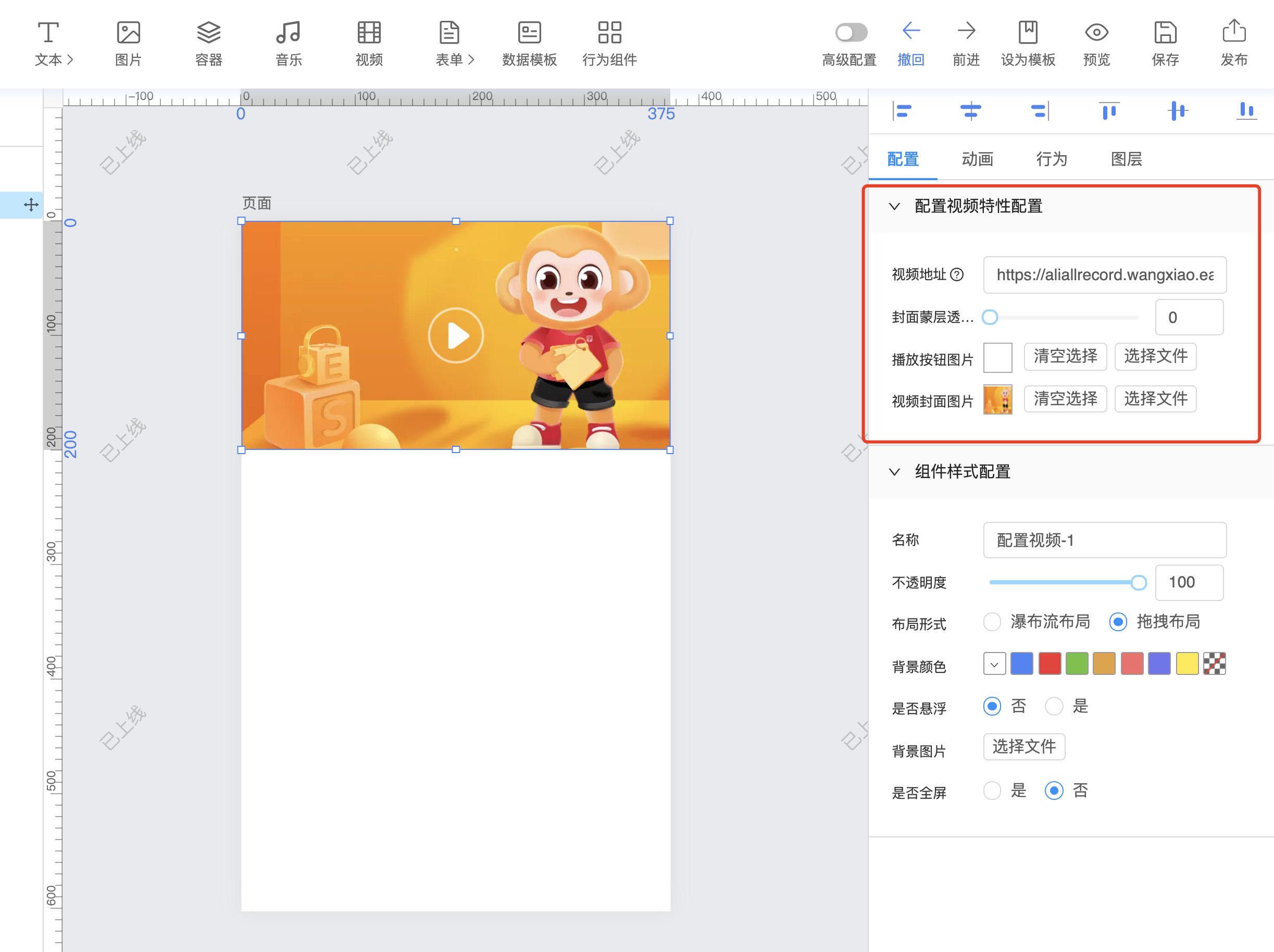
示例:
config: {
  content: { // content  自定义变量名
    type: 'NormalText', // 可选交互类型

    text: '按钮文字',

    msg: '提示内容',

    value: '请选择',

    when () { // 可选函数,用于控制该交互类型显示隐藏
      return true
    }
  }
}
# 规则组件配置分组
config: {
  // -为启用分组配置标示符、1为分组顺序、分组标题为显示的分组标题
  '1-分组标题': {
    property1: {
      text: '页面标题',
      type: 'NormalText',
      msg: '提示内容',
      value: '默认值'
    },
  }
}
配置成功如下图所示:
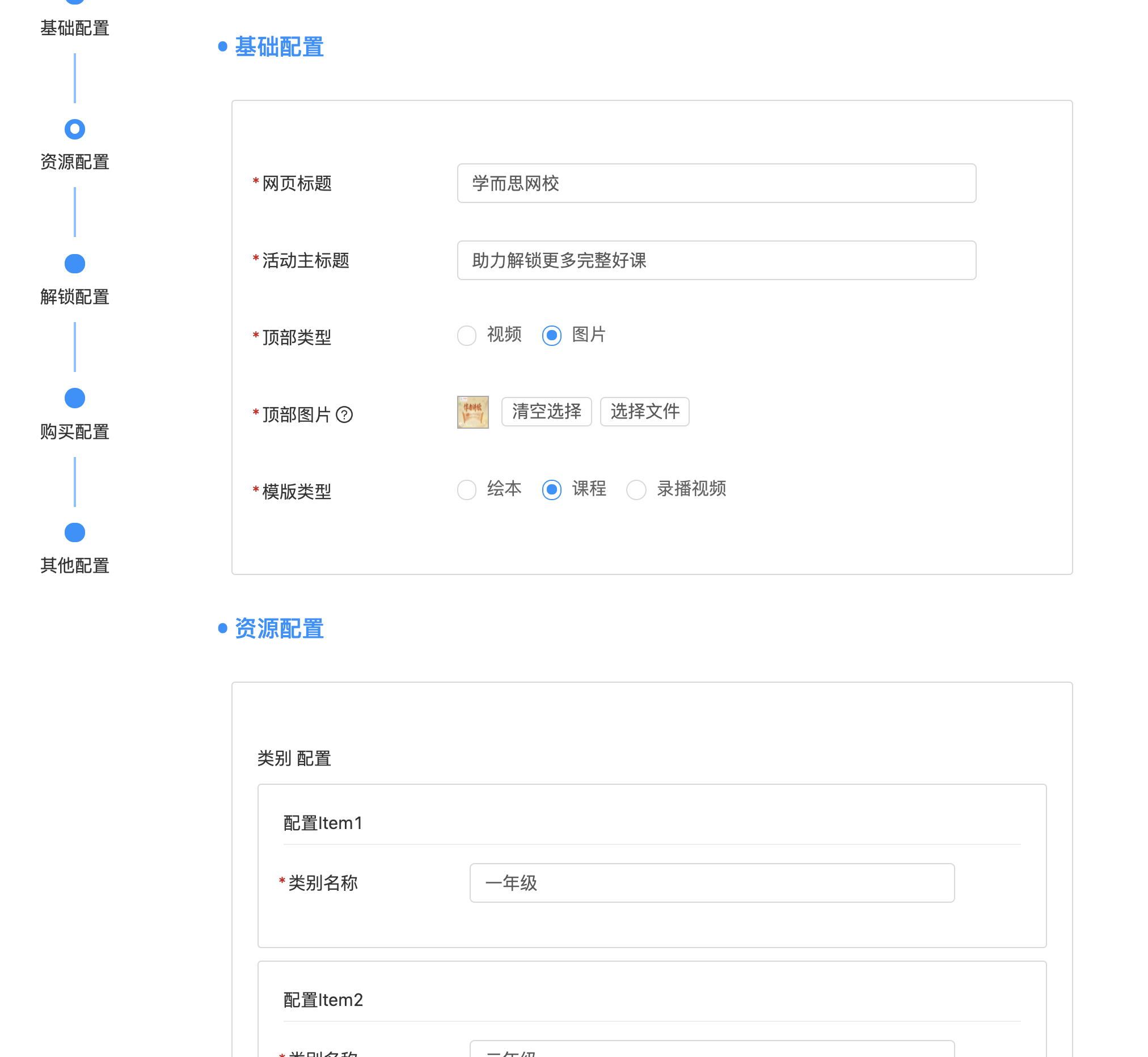
更多选项请参考 可选交互类型
# when
- 类型:Function
- 默认值:return true
可选函数,用于控制该交互类型显示隐藏
示例:分享操作,默认不显示蒙层时,只有选择显示蒙层时,才会出现蒙层选择的选项。
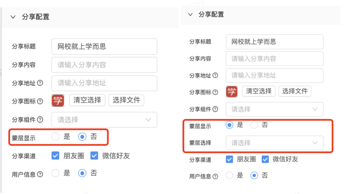
showModal: {
  text: '是否显示蒙层',
  type: 'RadioButton',
  value: false,
  options: [
    { text: '是', value: true },
    { text: '否', value: false }
  ]
},
modalWidget: {
  text: '蒙层选择',
  type: 'WidgetSelect',
  when(trigger) { // 通过when控制是否展示该选项
    return trigger.data.showModal;
  }
}
# 生命周期
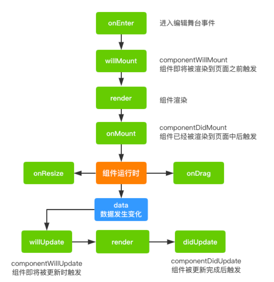
# onEnter
# willMount
# onMount
# willUpdate
# didUpdate
# onRender
# onResize
# onDrag
# onDoubleClick
# onScroll
# beforePublish
/**
   * 页面发布前调用
   *
   * @param  {Object} ctx 上下文
   */
    beforePublish: function(ctx) {
      // do something

      // 阻止发布
      throw new Error('发布失败')
    }
/**
   * 进入编辑舞台事件
   *
   * @param  {Object} ctx 上下文
   */
  onEnter: function (ctx) {},             // eslint-disable-line no-unused-vars

  /**
   *componentWillMount 时调用
   *
   * @param  {Object} ctx 上下文
   */
  willMount: function (ctx) {},

  /**
   * componentDidMount时调用
   *
   * @param  {Object} ctx 上下文
   */
  onMount: function (ctx) {},

   /**
   * componentWillUpdate
   *
   * @param  {Object} ctx 上下文
   */
  willUpdate : function (ctx) {},

   /**
   * componentDidUpdate
   *
   * @param  {Object} ctx 上下文
   */
  didUpdate : function (ctx) {},

  /**
   * 渲染事件
   *
   * @param  {Object} ctx 上下文
   * @return {string}     需要渲染出来的html字符串
   */
  onRender: function (ctx) {              // eslint-disable-line no-unused-vars
    return (
      <div className="business">
        <img className="business-logo" src={logos[this.data.selected]} />
        <ul className="business-btn" style={{backgroundColor: this.data.backgroundColor}}>
          <li onClick={this.onClick.bind(this, '0', 'A')}>A</li>
          <li onClick={this.onClick.bind(this, '1', 'B')}>B</li>
          <li onClick={this.onClick.bind(this, '2', 'C')}>C</li>
          <li onClick={this.onClick.bind(this, '3', 'D')}>D</li>
        </ul>
        <div className="business-desc">{this.data.content}</div>
      </div>
    );
  },

  /**
   * 调整尺寸事件
   *
   * @param  {Object} ctx 上下文
   */
  onResize: function (ctx) {},            // eslint-disable-line no-unused-vars

  /**
   * 拖动事件
   *
   * @param  {Object} ctx 上下文
   */
  onDrag: function (ctx) {},              // eslint-disable-line no-unused-vars

  /**
   * 双击事件
   *
   * @param  {Object} ctx 上下文
   */
  onDoubleClick: function (ctx) {},       // eslint-disable-line no-unused-vars
  /**
   * @description: 滚动事件
   * @param {type} obj 页面滚动距离
   */
  onScroll: function (obj) {}
};
# 页面变量
为整个页面提供变量,组件可根据变量值展示隐藏、变化展示内容,组件代码中也可以直接get、set变量。
以此实现页面内容根据交互、状态动态展示。
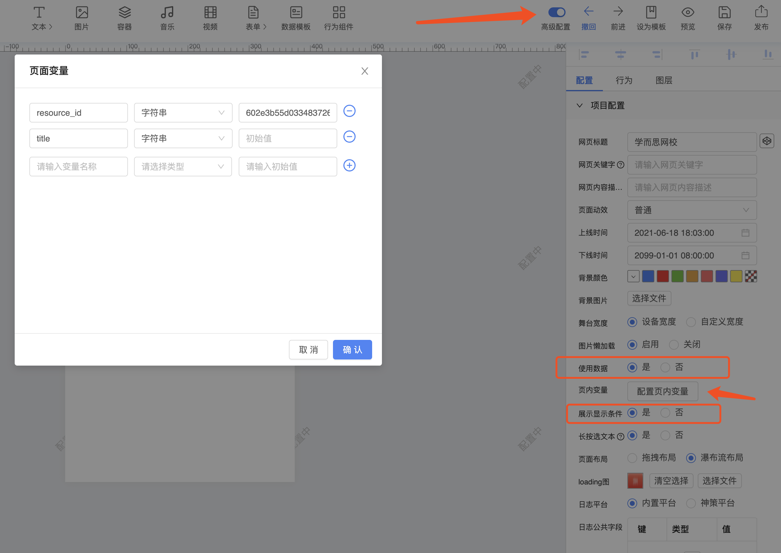
- 设置变量: 打开高级配置-打开使用数据-打开展示显示条件-点击配置页内变量
使用变量:
场景一: 通过变量控制内容展示
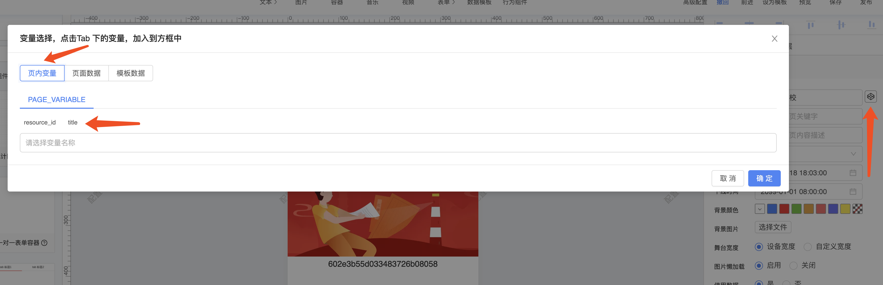
- 可使用变量的配置项最右侧会出现一个小图标,如下图
- 点击后出现弹窗,点击选择页内变量
- 点击选择变量名称
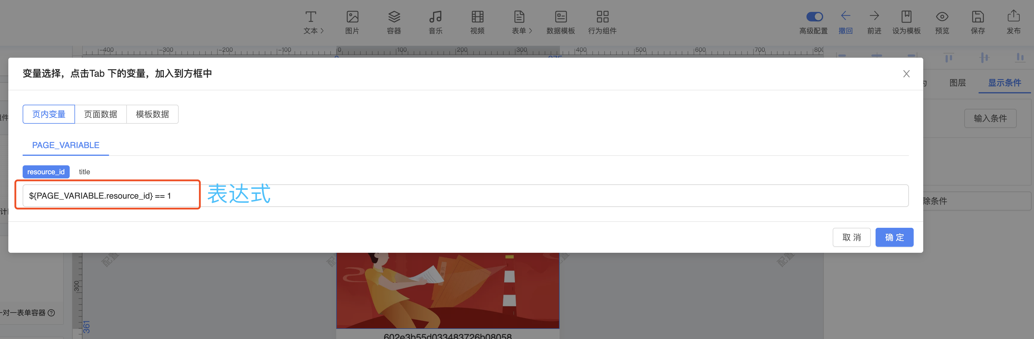
- 变量、常量可混合使用,语法等同于 ``,常用语法 >= <= ==
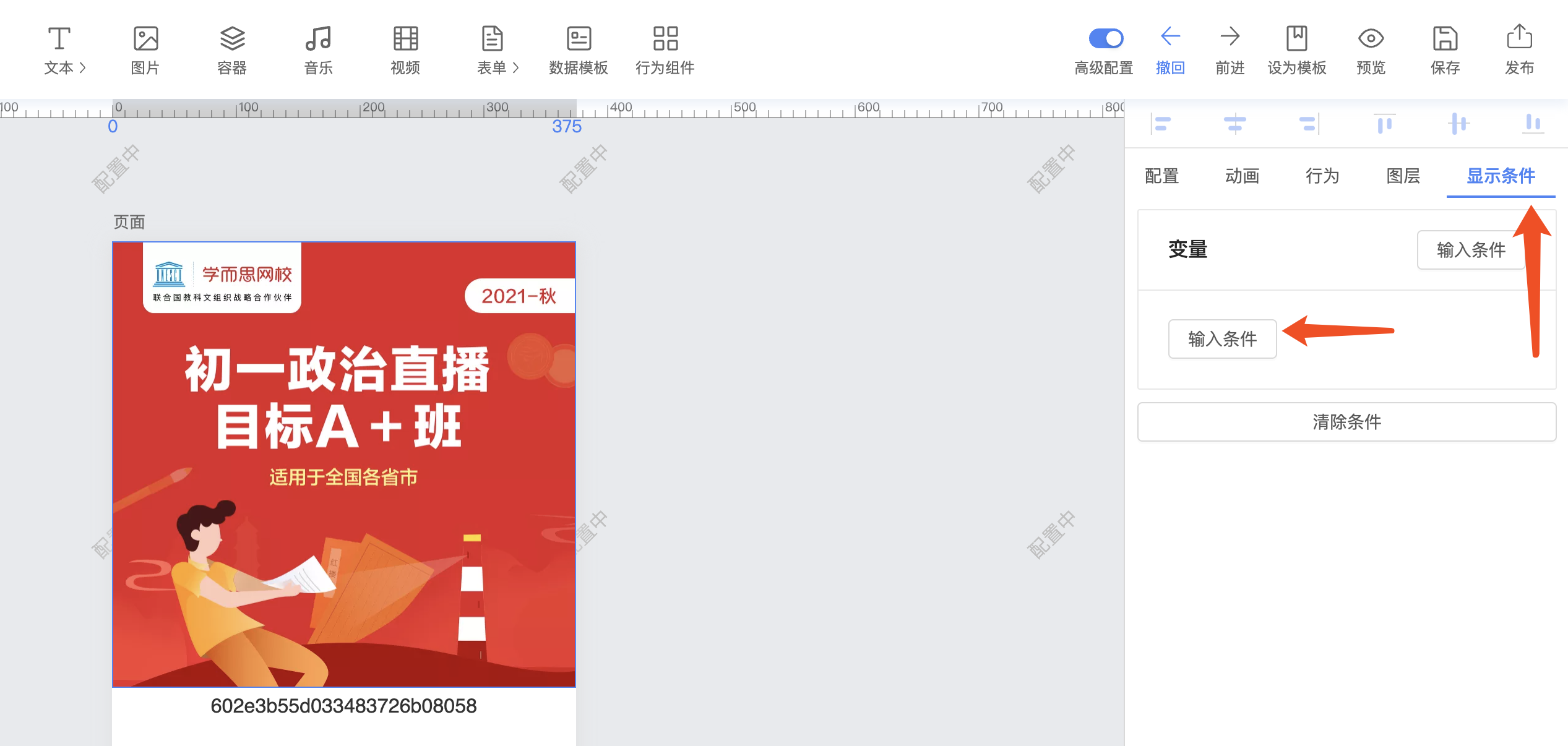
场景二: 通过变量控制组件展示
- 点击选中某个组件
- 右侧配置栏选择 ‘显示条件’
- 点击输入条件
- 点击变量名称
- 修改表达式,语法等同于 ``,常用语法 >= <= ==
获取变量:ctx.getPageData(key)
设置变量:ctx.setPageData(key, value)
打开组件配置使用变量开关
- 在开发组件时,配置项中设置 useData 为 true, 即可打开使用变量开关
config: {
  content: {
    ...
    useData: true
  },
}
# 组件通信
信息通道是编辑平台给组件之间提供互相通信,传递信息的一种方式。
组件 A 通过添加 "触发组件监听器"的行为,选择要触发哪个组件的哪个触发器,一个组件可以有多个触发器。
选择组件 B 通过 listeners 属性实现监听器函数,接收组件 A 的通知并处理。
现在,我们实现一个普通的按钮通过信息通道,切换 Tab 面板的实例。
- 编写切换 Tab 面板的监听器
listeners: {
  changePanel: {
      name: '切换面版',    // 监听器名称
      config: {          // 监听器需要的参数
          index: {
              text: '面板索引',
              type: 'NormalText',
              value: ''
          }
      },
      callback (options, ctx) {  // 监听器真正被触发时的执行函数,options 为发布者给订阅者传递的参数
        const { index} = options;
        console.log('index');
      }
  }
},
- 普通按钮添加触发组件行为,触发监听器

- 外部组件通过函数触发组件监听器
ctx.emmit({
    listener: 'changePanel',
    data: {index: index}
})